
Visual Identity - FOOD4HULL
GRAPHIC DESIGN
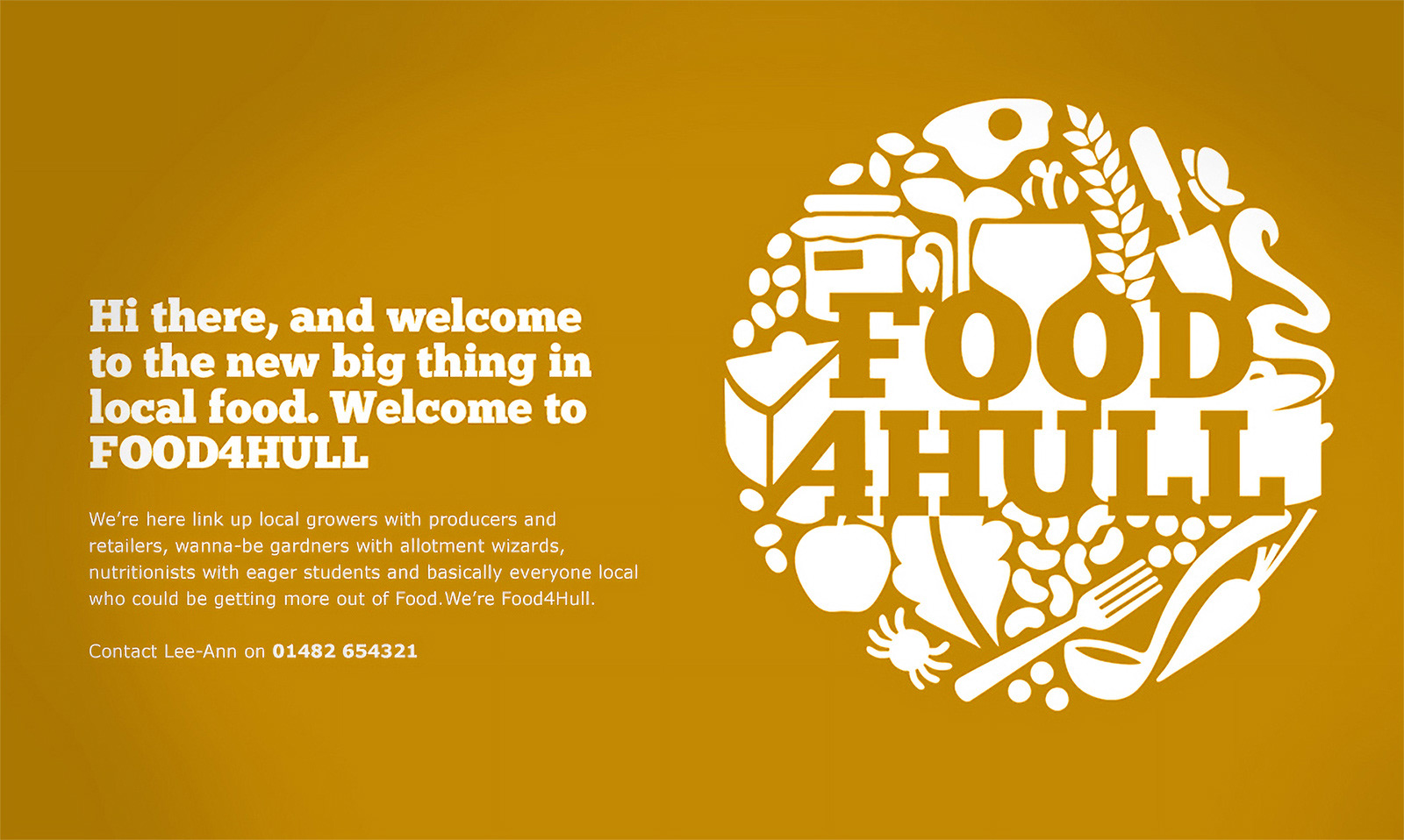
On being approached to design a visual identity for FOOD4HULL I couldn't resist having a crack at it in the fabulously inspiring Unilever style, consisting of multiple elements making up the whole.
It was quite a puzzle for a while, but all in all it was a lot of fun working out how to pull this off, and even illustrating it (curves in Adobe Ilustrator) was quick and painless.
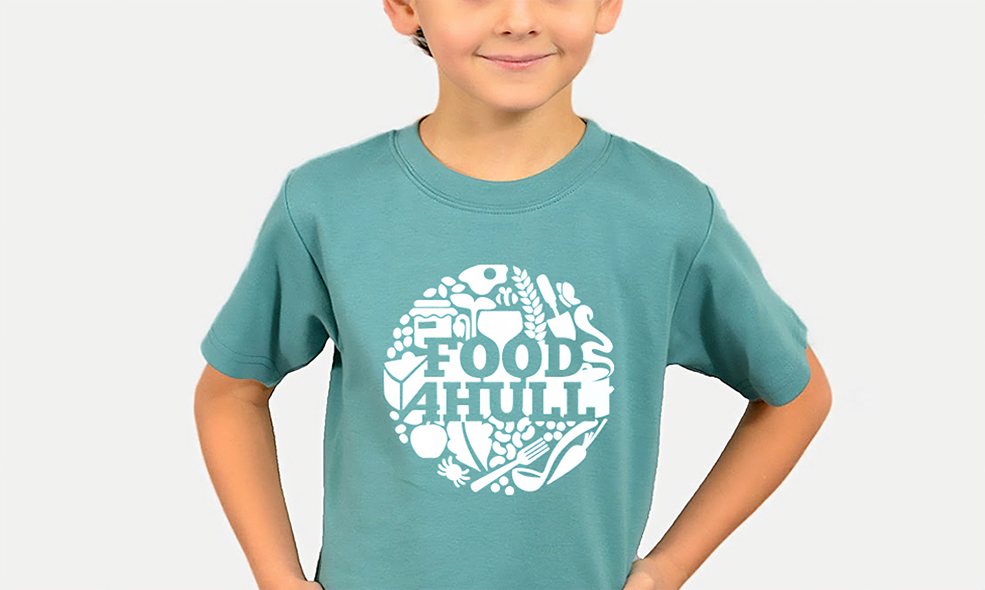
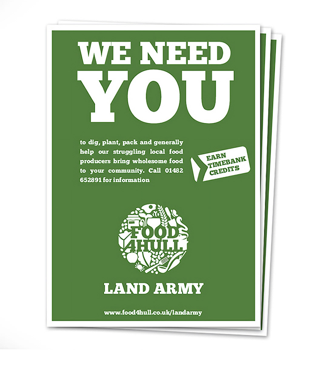
As with any visual identity, you gotta see in in context, so I created a bunch of use case visual examples, some of which are shown below, and as they were a very small grassroots organisation, I thought single colour printed stuff was more appropriate then vehicle wraps and billboards.
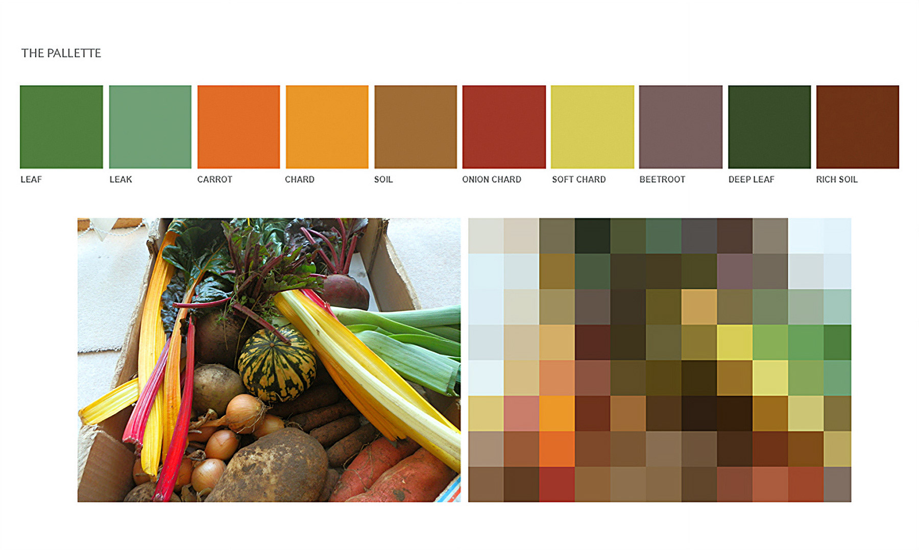
A funny aspect of it was having the idea to photograph and pixelate an organic veg box I had delivered and using those colours for the brand pallette. Crazy but it works eh :)